Since January, Morningmate’s user experience and interface have been undergoing gradual transformations. We are thrilled to unveil the latest enhancements and introduce an exciting new feature: adjustable chat window transparency.
Adjusting Chat Window Transparency
Ever wanted to add a touch of blur to your chat room? Now, with the Morningmate desktop app, you can effortlessly adjust the transparency of the chat window to your liking.

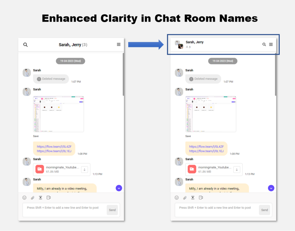
Improved Clarity in Chat Room Names
Do you find it confusing when multiple colleagues share the same name in chats? We’ve got you covered. Each chat room now prominently displays participants’ profile pictures at the top, making it easier to distinguish between them. Moreover, project chat rooms feature designated colours for quick identification.
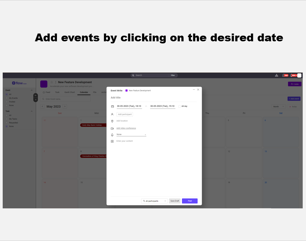
Simplified Event Creation in the Project Calendar
Have you ever wished you could simply click on a date to add an event to your project calendar? Now you can! Our enhanced project calendar allows you to swiftly create events by clicking on your desired date. Moreover, effortlessly select a range of dates by dragging your mouse.
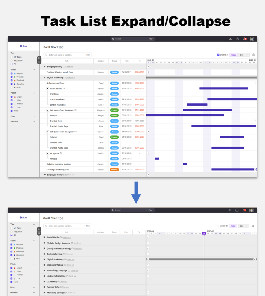
Improved Visibility of Overall Tasks and Gantt Charts
When reviewing overall tasks and Gantt charts, the task list can sometimes feel overwhelming. We’ve simplified it for you! You can now collapse the task list, allowing you to focus on project names at a glance.
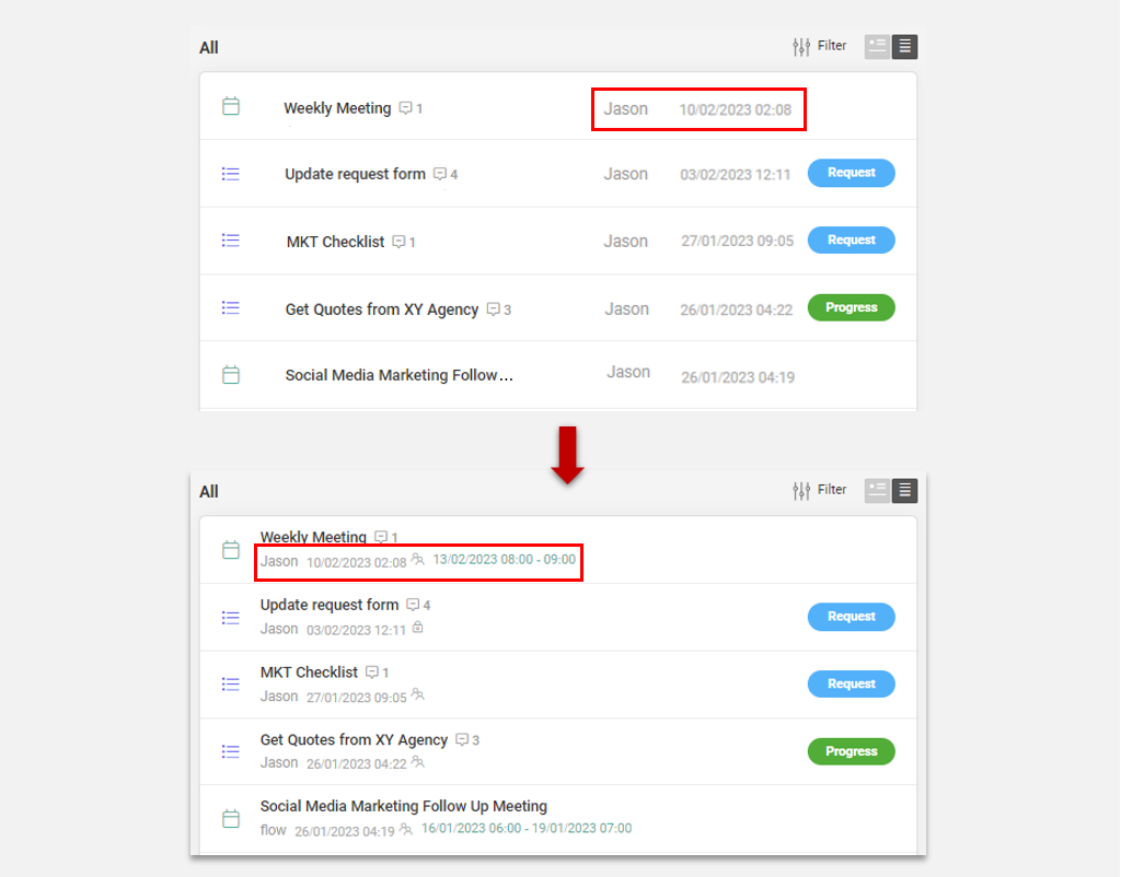
Enhanced List View for Posts
Looking for a way to quickly skim through post titles while having the option to access more detailed information? We’ve got the perfect solution. Even in the list view, you can expand post titles and explore detailed permissions.
At Morningmate, we highly value your feedback and continuously strive for improvement. Keep sharing your valuable suggestions with us as we work tirelessly to enhance your experience.


